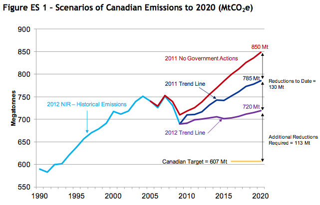
Have you heard the great news? Canada is half-way to achieving its goal to reduce green house gas emissions to 17% below 2005 levels by 2020. Sure, its not the 18% below 1990 levels that the Kyoto accord called for, but it is something right? At the very least, the goal is set in Megatonnes of actual GHG’s rather than ‘intensity’ targets, which historically have been the preferred method of conservative action on climate change. So that’s progress right? The Harper government is making legitimate emission reduction targets and is moving towards them. But environmentalists remain unsatisfied. This post will explain why. In early February, we went out to cover the Rally for Climate Justice (check out the video here) that was put on by the University of Toronto Environmental Action group. And in the process of editing the video, I came across this graph in Environment Canada’s Emission Trends report for 2012.
 This graph blew me away—and not because of the emission reductions that it is highlighting. It blew me away that anyone could think that this graph shows the government in a positive light. In my eyes, this graph, and the Environment Canada package it is a part of, epitomizes why environmentalists inherently distrust this Conservative government. A quick look at this graph tells you a few things:
1) Emissions are lower now than they were for much of the 2000’s
2) Emissions dropped dramatically around 2008
3) Emissions have been slowly rising ever since
I would be the first to admit that if I had been shown this graph when Harper came to power, I would not have believed it. So what happened? Well, in short, the 2008 market crash happen. The dramatic drop off is in line with the drop in Canada’s economy in general, and emissions started rising again when the economy started to recover. Nothing meaningful changed. And if we dive deeper into the numbers we can see just how little the Federal government has achieved.
First, let me direct you back to the graph, and to the difference between the dark blue ‘2011 Trend Line’ and the purple ‘2012 Trend Line’. The difference looks impressive until you scroll back up the document and realize that the difference is largely due to a ‘Key Milestone’ that turns out to include land-use, land-use-change, and the forestry sector as a part of the calculation of GHG emissions. Or put more bluntly, Canada expects to be cutting down fewer trees in 2020, nature absorbs CO2, and you should give us credit. Labeling this as a ‘Key Milestone’ is like an person who is implementing a tighter budget deciding that they can keep spending the same amount as long as they start considering the times they make their own coffee as ‘money saved’.
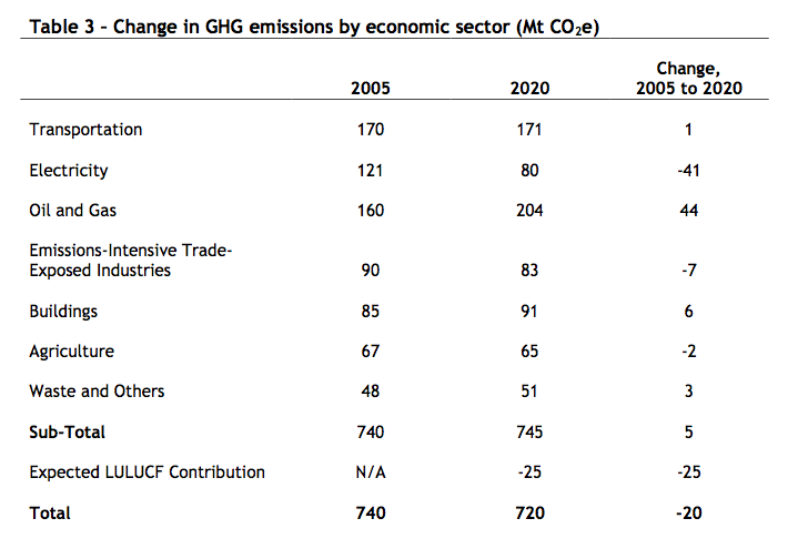
This table comes later in the report.  I know this table is boring and I apologize. But take a quick look at it. Remember that the federal government included this table in a document that brags that Canada was ‘halfway to its Copenhagen commitment in carbon reduction’. Three things stand out in this graph. First, it appears Canada is doing a fantastic job in reducing GHG emissions created by electricity production, which is certainly encouraging. Second, all of those reductions will be undone by the increase in GHG emissions from the Oil and Gas sector. Third, and most ridiculous, is that despite the claims that they are halfway to their targets, the actual projection has Canada emitting 745 Megatonnes of GHG’s in 2020. That’s five megatonnes more than in 2005, and the projected 20 Megatonne drop is entirely due to the inclusion of land-use into how it’s calculated and in no way tied to emission reduction created by government programs.
With this blog I try to avoid demonizing anyone in the hope of not alienating readers who hold alternative viewpoints. But if someone tries to convince you that the current conservative government actually cares about reducing emissions, then show them this document. If this is progress, where are we headed?
By: Stefan Hostetter

